Data Art
A few months back while starting to work in data visualizations, I realized people were doing really beautiful data visualizations, some of them resemble artworks. With that in mind, I had the thought that it would be cool to use data visualization as a way of expressing data via artworks.
Then I spent some time reading about it, understanding different ways of making data art, and where it all started.
There is a long history of making quantitative and qualitative data visualizations in the world, some of which can be seen today as both a way of storing and interpreting data and also as artworks. One notable example of this is Quipu, a knotted strings device used by South American Andean people. The knots stored numeric and other values encoded usually in a base-ten positional system. Lately, Quipus are preserved not only as a historical device but also as an artwork made by Inca people. Information art, which is the art that is inspired by data, information, computer science, and related data-driven fields, is considered to have its earliest example in the 1970 exhibition “Information” at the Museum of Modern Art in New York City. In parallel to this exhibition, Conceptual Art emerged as a tendency in the world, and in the United States arose the activities of “Experiments in Art and Technology”.
This entry in the portfolio will cover how I transformed and worked with data to create visualizations that could be part of an exhibition, and how I learned to make data visualizations in Python using Holoviews and Matplotlib libraries.
Important note: This was one of my first data visualizations exercises, there is room for improvement and I mention some of the things I would like to add further at the end of this post. Previously, I did some data visualizations using Excel and Tableau (As part of one of the Build Course activities) however, because I wanted to have more control over the components that make a data visualization (labels, colores, lines, etc) I decided to learn and use Python for this.
If you just want to see the code, the whole data art/visualization project (including all files needed) is up on Github
When the pandemic started, data about COVID-19 started flooding all types of media. This included maps of how the disease was spreading through the world, how many people were infected and how of them died, etc., also scientists worked to decipher the genome of the virus that causes the disease. In a global effort to share information all data discovered is uploaded to the Global Initiative on Sharing All Influenza Data (GISAID), which is free and open to any person who wishes to know more about it. Since the first genome was uploaded to GISAID, scientists have sequenced over 3000 different strains of the virus. For this work, I will use a particular strain found in a 49 years old patient in Melbourne, Australia. You can access the genome and all the related data (and metadata) from GISAID (Keep in mind that you need to register before).
In general terms the process to create data visualizations is:
- Get Data
- Transform Data
- Visualize Data
As I stated before the Get Data part was made using the GISAID database, from where I downloaded a FASTA File (To see more about FASTA files go to this link).
However, the data wrangling was different for each of the three visualizations that I made.
Chord Chart
One of the obvious places for me to start thinking about making art with data, was on the relationships that exist between each of the different nucleotides that make the virus’ genome and arrange them to see which one is more likely to be related to each of the other nucleotides. Because it has over 30,000 occurrences of the four nucleotides (ACGT), this task needed to be automated to save time and avoid errors that could be made if I was/were going to make it manually.
But before getting to that part, the FASTA file needs to be imported into the system and then extract the sequence from it. To do that, BioPython is a very useful tool.
# store the name of the FASTA file in a variable

fasta_file = "EPI_ISL_419959.fasta"

# open the FASTA file
# this will store all the data from the file
# the outout will be something like this:
#
# ID: hCoV-19/Australia/VIC266/2020|EPI_ISL_419959
# Name: hCoV-19/Australia/VIC266/2020|EPI_ISL_419959
# Description: hCoV-19/Australia/VIC266/2020|EPI_ISL_419959
# Number of features: 0
# Seq('ACTTTCGATCTCTTGTAGATCTGTTCTCTAAACGAACTTTAAAATCTGTGTGGC...AAA', SingleLetterAlphabet())
#
# we are only interested in the seq part of the file

mito = SeqIO.read(fasta_file,"fasta")

# store the sequence in a string

sequence = mito.seq
First I imported the FASTA file into a SeqRecord object, then I parsed the actual sequence into a string variable which I will use to make all the data wrangling.
Then to get the relationships (Which nucleotide goes next) the process I followed is:
Transform the string into a list of characters Iterate each element of the list and count the occurrences of each element and the element after it. With that count, update the dataset to reflect the number of relationships.
# -------------------------------------------- #
# ------------ data wranglings --------------- #
# -------------------------------------------- #

# transform the string into a list of characters
for letter in sequence:
    lista.append(letter)

# store the number of relationships occurred (i.e, AA, AC, AT, etc)
for i in range(len(lista)-1):
    dictionary[str(lista[i]+lista[i+1])] = dictionary[str(lista[i]+lista[i+1])] +1

# add values to the datased used for the actual diagram
for k in dict_aux:
    data[dict_aux[k]]["value"] = dictionary[k]
Example: The sequence “ATCAAACG” would have the next relationships:
- AT
- TC
- CA
- AA
- AA
- AC
- CG
With that data, and indexing nucleotides as follow, we would have the next dataset:
| Source | Target | Value |
|---|---|---|
| A | T | 1 |
| T | C | 1 |
| C | A | 1 |
| A | A | 2 |
| A | C | 1 |
| C | G | 1 |
In simple terms what this means is:
| What is the nucleotide we are looking at | What is the next nucleotide in the sequence | How many times this pattern occurs in the whole sequence |
Now that the number of relationships is stored in our dataset, we can use Holoviews to create the chart but before it, we will need to transform the dataset stored in a dictionary to a Pandas dataset. Pandas is a library, extension of Numpy, used to store and transform data. I also added the name of each index (nucleotide) to the dataset. Even if in the end I didn’t use the names, it is useful to understand how they are related to each other.
transform data to a Pandas dataset
links = pd.DataFrame(data)
nodos = [{"name":"Adenine", "index":1},{"name":"Cytosine", "index":2},
         {"name":"Guanine", "index":3},{"name":"Thymine", "index":4}]
nodes = hv.Dataset(pd.DataFrame(nodos), 'index')
With the dataset created, I could create the first visualization. In the beginning, it didn’t have all the labels but later I discovered how to add them. The first chord chart looked something like this:
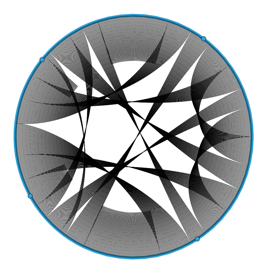
It made sense, to a certain extent, but without knowing what each of the lines and points means it’s hard to understand if that was what I wanted to create. Looking at the documentation of holoviews, I found how to add colors and labels to the chart and ended up with a fairly good looking chart:
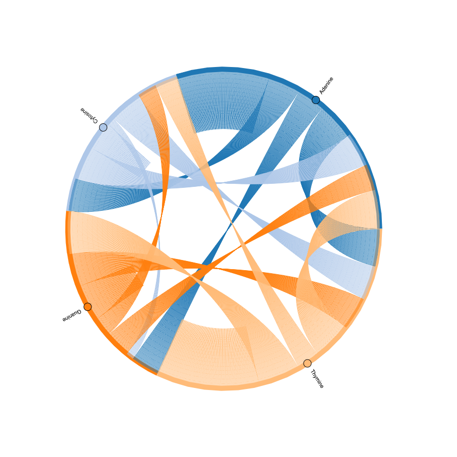
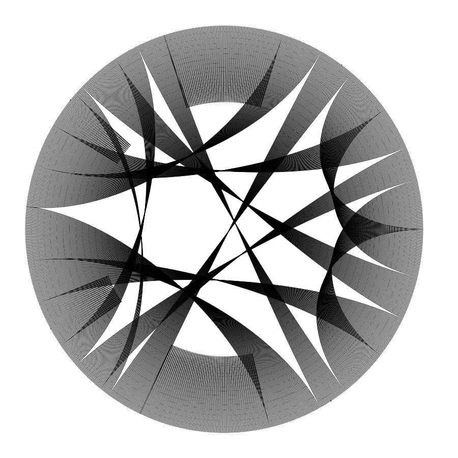
With these changes, it looked good, but in the end, it is just another data visualization, which could be something that can be an artwork for some people but I wanted to explore different ways of visualizing data and, if possible, create a physical representation of it. Playing with values of color, labels, and thickness of lines, the final data visualization/artwork I created is:
More Art
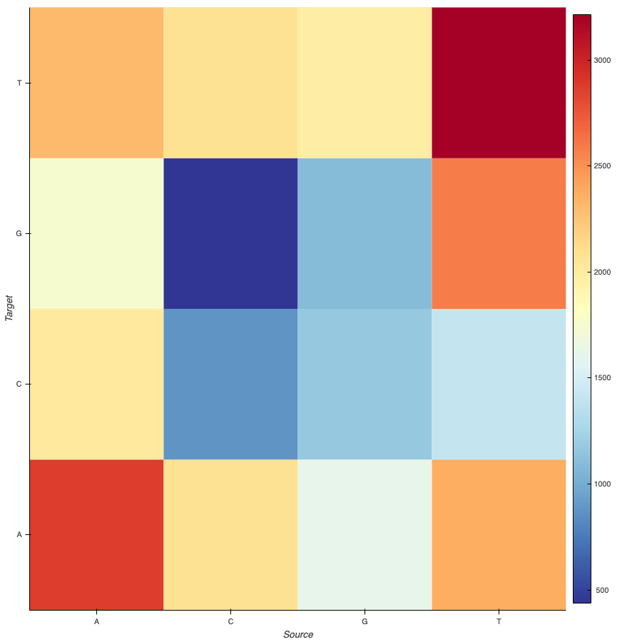
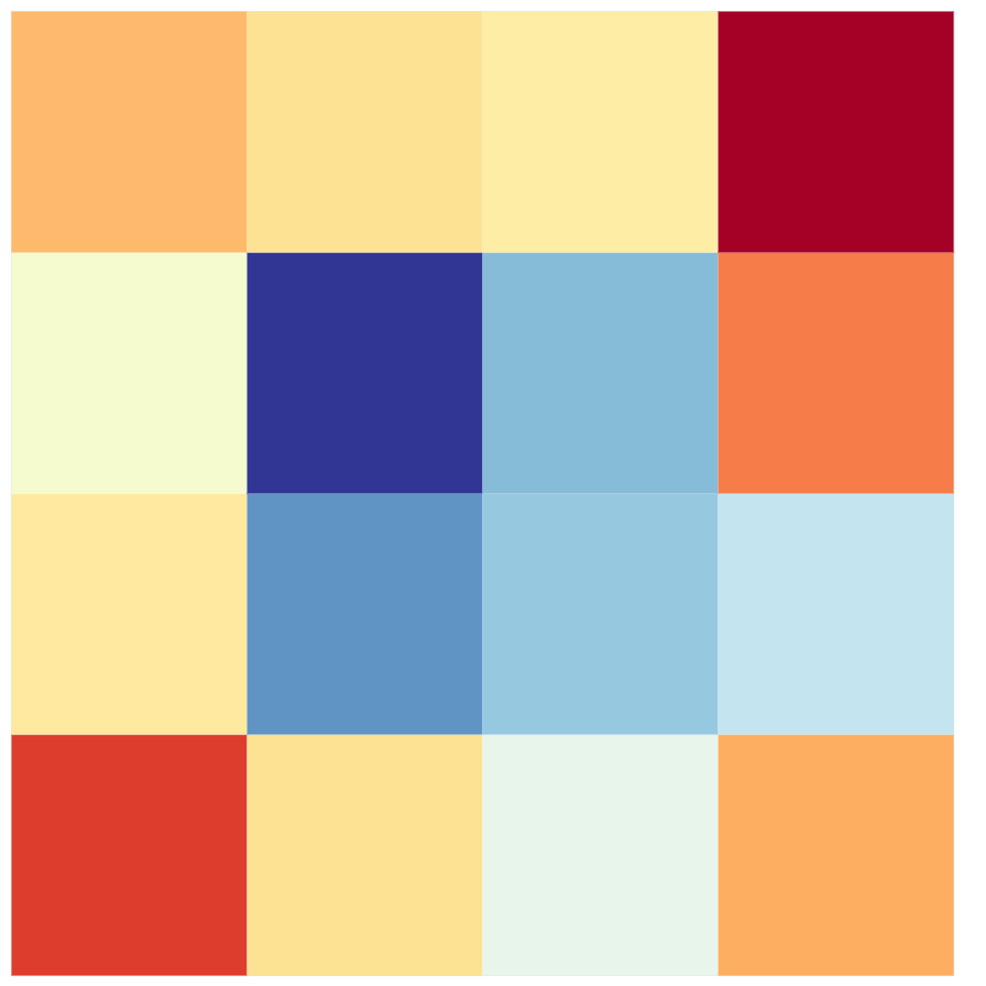
Another approach I took when analyzing the genome sequence, and its relationships was how many of these relationships are, and how would that look like in a heatmap. To do this I was able to use the data wrangling from the previous visualization and create a new dataset as it was needed for holoviews to create the heatmap chart.
# -------------------------------------------- #
# ------------ data wranglings --------------- #
# -------------------------------------------- #

# transform the string into a list of characters
for letter in sequence:
    lista.append(letter)

# store the number of relationships occurred (i.e, AA, AC, AT, etc)
for i in range(len(lista)-1):
    dictionary[str(lista[i]+lista[i+1])] = dictionary[str(lista[i]+lista[i+1])] +1

# create the dataset
for i in range(len(data)):
    data[i][2] = dictionary[data[i][0]+data[i][1]]
The only change was that instead of having a source and a target as indexes, there were two labels for each relationship. The first one was the source, and the second one was the target.
With this data, the chart with labels was something like this:
And because I wanted to have just the colors and not the labels, with some changes, the output was:
Making physical data art
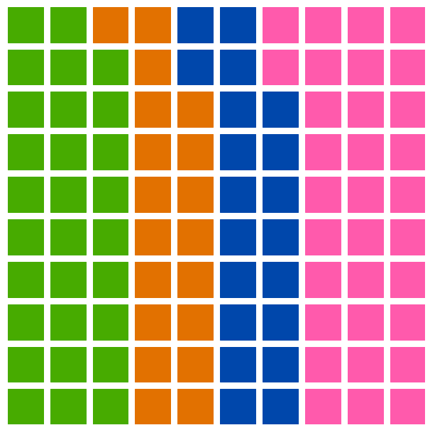
The next example uses another approach; instead of using the relationships between each nucleotide, I took the percentage of each nucleotide in the whole sequence. To do this, after importing and extracting the data from the FASTA file, as done in the previous data visualizations, I simply counted the number of each nucleotide in the whole sequence. With this data, I wanted to show it in a 10x10 grid, with each square being 1% of the whole sequence.
This was the main idea however, Holoviews does not possess the option to visualize the data in the way I wanted to show it. Because of that, after reviewing the chart options and libraries I was able to use, I decided to go with Matplotlib [link] with an add-in called PyWaffle. Also, I learned that the chart I wanted to create is called a Waffle chart.
# -------------------------------------------- #
# ------------ data wranglings --------------- #
# -------------------------------------------- #

# get percentages of each nucleotid
# TODO: develop a function to get the right amounts comparing them and avoid hardcoding
a = math.ceil(sequence.count("A")/len(sequence) * 100)-1 # harcoded to substract one.
c = math.ceil(sequence.count("C")/len(sequence) * 100)
g = math.ceil(sequence.count("G")/len(sequence) * 100)
t = math.ceil(sequence.count("T")/len(sequence) * 100)

# with the percentages, create the dataset to use
data = {"A": a, "C": c, "G": g, "T":t}
After counting the occurrences and getting the percentage of each one of the nucleotides (and hardcoding a value I was not able to get using code), I created the visualization, which was something like this:
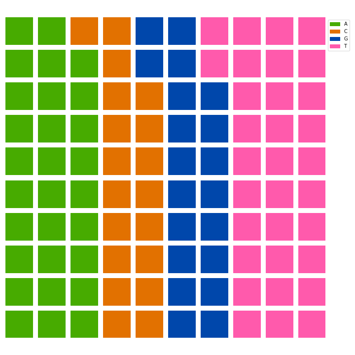
There is an annotated version and an artistic version, with no labels in the visualization:
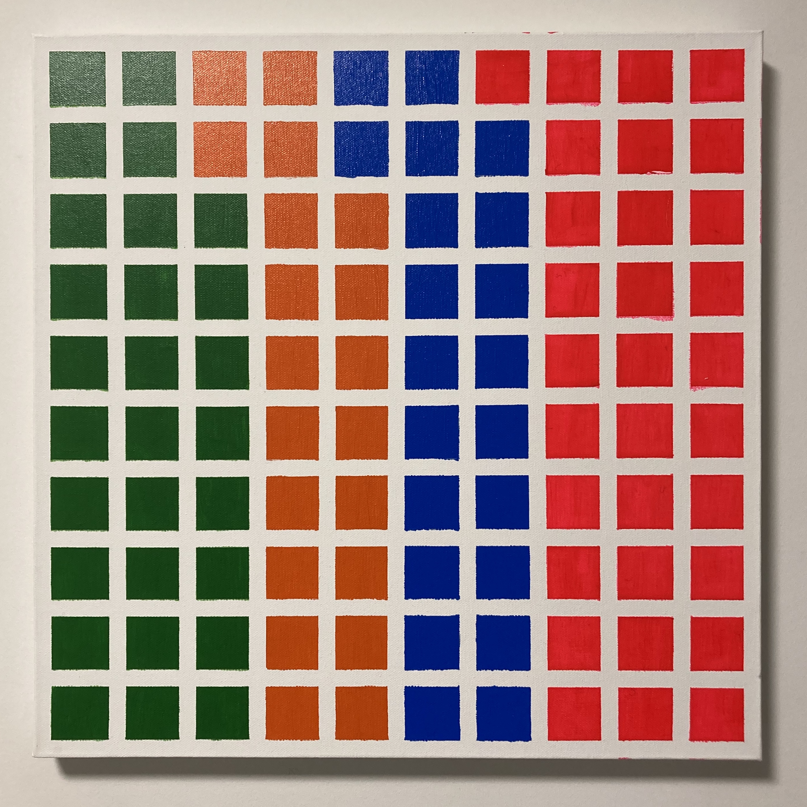
After making this visualization I realized that it was easy to reproduce in a physical medium. That was the reason that led me to a local art supplier, get a canvas, brushes, paints, and tape, and created a physical version of the data visualization.
Conclussions and further development
Data visualization is a tool that enables practitioners of the new branch of engineering to understand and make decisions based on the analysis that is made with such visualizations. Data visualization also allows people to tell a story, one data visualization by itself is meaningless if there is not an explanation or a story for people to understand what is the data artist trying to communicate.
For these three visualizations in specific I would like to propose some improvements:
Adding feedback loops: To keep in mind that feedback is a key component for cyber-physical systems, and hence to cybernetics, I would like to add feedback from the viewer to the artwork. This could be done by adding interactive pieces, including interfaces to include data from the viewer, etc. Generating real-time visualizations: Data is everywhere and every second we are generating data. With this further development, one could include data that is generated by the viewer or gathered from an external source, transform that data in real-time, and then visualize it in the form of an artwork. This option would be suitable to be shown in a live installation or performance where people could be aware of some real-time data in a generative artwork. Generative art: Generative art is created by algorithms that combine randomness and noise with tools to create visualizations that resemble different types of artworks (scrawls, drawings, writing, etc). One way to include data in generative algorithms would be instead of using randomness or noise use a dataset and work with it to generate artworks. Art is an always evolving field, and data art is not external to this. Even in the term has first used in the 70s, information or data art keeps adding new tools to the way artists work. With new trends such as the internet, cyber-physical systems, and the enormous amount of data that is created every second, the possibilities are unlimited.
Rather than saying that this will be the future of the arts, I would like to render some questions about the impact that this will have in both artists and art itself.